
An extension of the Numpy library named “matplotlib” is used for plotting static, animated graphs in Python. This library analyzes large sets of data in pictorial form for easy understanding. To create a bar chart in Python, the “plt.bar()” and “plt.barh()” functions are used in Python.
This guide will provide multiple examples of creating a bar chart in Python:
- How to Create a Bar Chart in Python using Matplotlib?
- Example 1: Create a Bar Chart Using the bar() Function
- Example 2: Modifying the Bar Chart Using Matplotlib Function
- Example 3: Create Multiple Bar Chart Using Matplotlib Function
- Example 4: Create the Bar Chart With Pandas DataFrame
- Example 5: Create a Horizontal Bar Chart in Python
How to Create a Bar Chart in Python using Matplotlib?
The “matplotlib” offers several functions to create a bar chart, such as “plt.bar()” for vertical and “plt.barh()” for horizontal. The bar chart can be modified using the “plt.bar()” function, such as font size, color, etc.
Let’s start with the first example of creating a bar chart using the “plt.bar()” function.
Example 1: Create a Bar Chart Using the plt.bar() Function
In the example code given below, the “plt.bar()” is utilized to create a bar chart:
Code:
import matplotlib.pyplot as plt
Name = ['Joseph', 'ALex', 'Henry', 'Anna', 'John']
Age = [25, 42, 52, 29, 27]
plt.bar(Name, Age)
plt.title('Name Vs Age')
plt.xlabel('Name')
plt.ylabel('Age')
plt.show()
In the above code:
- The “matplotlib.pyplot” is imported at the program’s start.
- The values written on the “x-axis” and the values written on the “y-axis” are passed in the form of a list.
- The “plot.bar()” function returns the bar chart of the given x-axis and y-axis values.
- The “title()”, “xlabel()” and “ylabel()” functions are used to display the title, xlabel and ylabel representation.
Output:
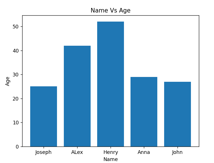
The above output shows the bar chart graph of “Name Vs. Age”.
Example 2: Modifying the Bar Chart Using Matplotlib Function
Modifying the bar chart graph can be done using the various “matplotlib” functions. The below code modifies the previous example:
Code:
import matplotlib.pyplot as plt
Name = ['Joseph', 'ALex', 'Henry', 'Anna', 'John']
Age = [25, 42, 52, 29, 27]
plt.bar(Name, Age, color=['Orange', 'blue', 'Red', 'Green', 'teal'])
plt.title('Name Vs Age', fontsize=15)
plt.xlabel('Name', fontsize=15)
plt.ylabel('Age', fontsize=15)
plt.grid(True)
plt.show()
In the above code:
- The “color” parameter is passed inside the “plt.bar()” function to show each bar with a different color.
- The “plt.grid()” function shows the grid on a bar chart graph.
- Similarly, the “fontsize” parameter is used inside the “plt.xlabel()” and “plt.ylabel()” functions to increase the labeling font of the bar chart.
Output:

The above snippet shows the modified bar chart.
Example 3: Create Multiple Bar Charts Using Matplotlib Function
In the following example, the multiple bar charts are created using the matplotlib function:
Code:
import numpy
import matplotlib.pyplot as plt
X_1 = ['Team 1','Team 2','Team 3','Team 4', 'Team-5']
X_2 = [50,30,40,90,75]
X_3 = [60,90,85,35,55]
X_axis_data = numpy.arange(len(X_1))
plt.bar(X_axis_data - 0.2, X_2, 0.4)
plt.bar(X_axis_data + 0.2, X_3, 0.4)
plt.xticks(X_axis_data, X_1)
plt.xlabel("No of Teams")
plt.ylabel("Total Scores")
plt.title("Total Teams Stats")
plt.show()
In the above code:
- The data to be plotted on multiple bar charts are taken into the list.
- To create the value range, the “np.arange()” function is utilized in a program. In our scenario, the “X-axis” value creation depends on the number of Teams.
- The “plt.bar()” function of the “matplotlib” module is utilized to create the bar chart.
- We shift the graph “(+0.2) to (-0.2)” to avoid overlapping the bar and take the width “0.4”.
Output:
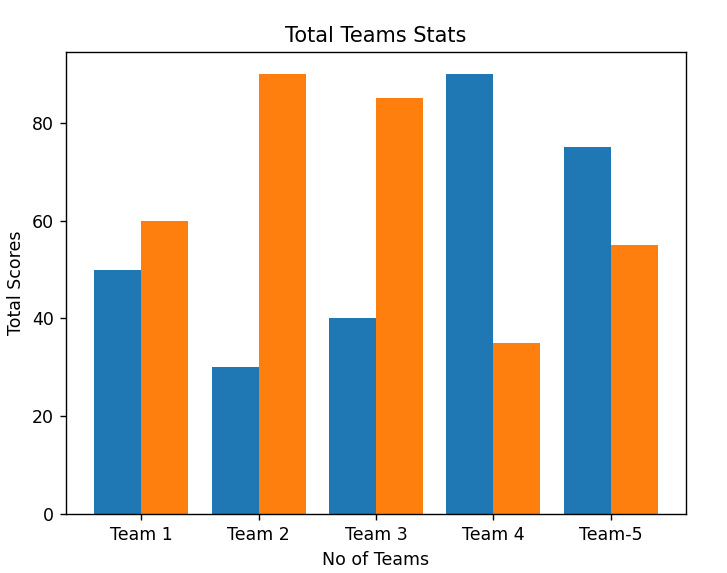
The above snippet shows multiple bar charts.
Example 4: Create the Bar Chart With Pandas DataFrame
In the example given below, the bar chart is plotted by taking the value from the pandas DataFrame:
Code:
import pandas
import matplotlib.pyplot as plt
X_1 = {'Candidate': ['John', 'Henry', 'ALex', 'Joseph', 'Anna'],
        'Salary': [25000, 45000, 55000, 90000, 50000]}
data = pandas.DataFrame(X_1)
plt.bar(data['Candidate'], data['Salary'])
plt.title('Candidate Vs Salary', fontsize=11)
plt.xlabel('Candidate', fontsize=11)
plt.ylabel('Salary', fontsize=11)
plt.show()
In the above code:
- The pandas DataFrame is created by taking the dictionary values and stored in a variable “data”.
- The “plt.bar()” function takes pandas DataFrame variable with column name to create the bar chart.
Output:
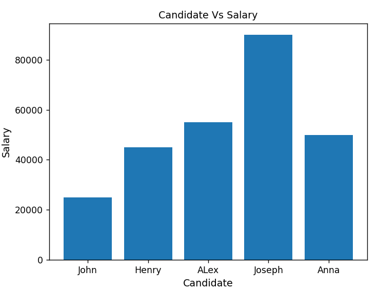
The above snippet shows the bar chart with values from pandas DataFrame.
Example 5: Create a Horizontal Bar Chart in Python
The horizontal bar chart can also be created using the matplotlib module. Let’s understand it by the following example:
Code:
import pandas
import matplotlib.pyplot as plt
X_1 = {'Candidate': ['John', 'Henry', 'ALex', 'Joseph', 'Anna'],
        'Salary': [25000, 45000, 55000, 90000, 50000]}
data = pandas.DataFrame(X_1)
plt.barh(data['Candidate'], data['Salary'])
plt.title('Candidate Vs Salary', fontsize=11)
plt.xlabel('Candidate', fontsize=11)
plt.ylabel('Salary', fontsize=11)
plt.show()
In the above code, the “plt.barh()” is used to create the horizontal bar chart of the given DataFrame.
Output:
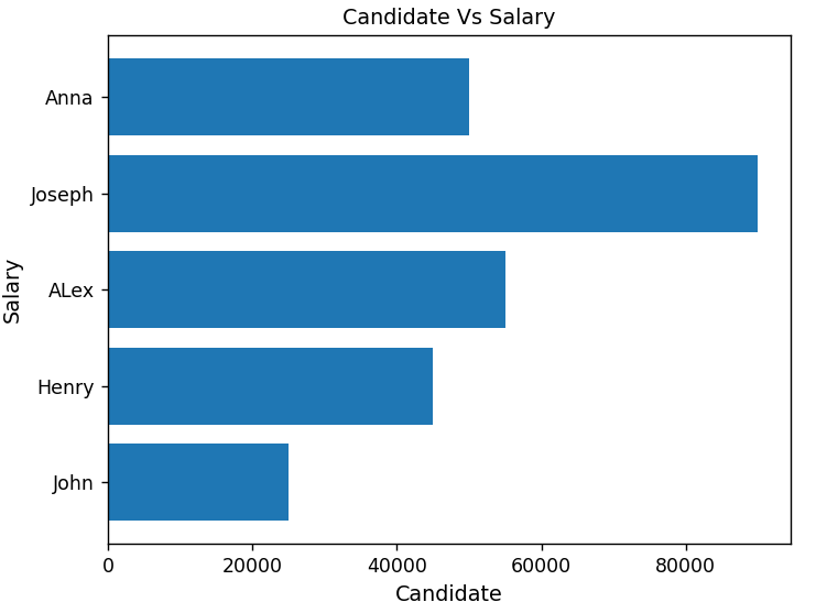
The above snippet shows the horizontal bar chart in Python.
Conclusion
To create a bar chart in Python, the “plt.bar()” function of the matplotlib module is utilized. The multiple bar chart and the horizontal bar chart are also created using the “plt.bar()” and “plt.barh()” functions. The different matplotlib functions and their parameters are used to modify the bar chart in Python. The bar chart was also created using panda’s DataFrame data in Python. This guide provided an overview of how to create a bar chart in Python.