
In Python, the “matplotlib” library is used to deal with the graph or visualization. The wide range of functions of “matplotlib” allows you to create a bar chart, line chart, histogram chart, etc., to analyze and visualize data. The “plt.hist()” function of the Matplotlib is used to plot a histogram in Python.
This post will guide you to plot a Histogram in Python using Matplotlib with the following content:
- Using Python Matplotlib Module to Plot a Histogram
- Example 1: Plot Histogram Using plt.hist() Function
- Example 2: Customization of Histogram in Python
- How to Calculate the Number of Bins?
Using Python Matplotlib Module to Plot a Histogram
To plot a histogram in Python, the “matplotlib” module provides a function named “plt.hist()”. But to access the matplotlib function, we need to install the matplotlib module in Python.
Type the given below code command in the cmd to install the Python “matplotlib” module:
> pip install matplotlib
After installing the module; you can plot the histogram using the matplotlib function “plt.hist()”.
Example 1: Plot Histogram Using plt.hist() Function
In the code given below, the “plt.hist()” function is used in Python to plot the histogram:
Code:
import matplotlib.pyplot as plt
data_Set = [1,5,10,15,20,25,30,35,40,45,50,55,60,65,70,75,80,
    85,90,95,45,40,35,30,25,10,5,55,65,75,85,95,90,40,30,20,60,45,65]
plt.hist(data_Set, bins=10)
plt.show()
In the above code, the “plt.hist()” function accepts the “data_Set” and bins values as arguments and retrieves the histogram.
Output:
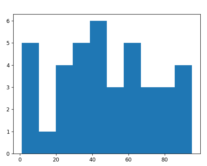
The above output shows the histogram for the given “data_Set”.
Example 2: Customization of Histogram in Python
In the code example given below, the matplotlib module’s functions are used to customize the histogram:
Code:
import matplotlib.pyplot as plt
data_Set = [1,5,10,15,20,25,30,35,40,45,50,55,60,65,70,75,80,
    85,90,95,45,40,35,30,25,10,5,55,65,75,85,95,90,40,30,20,60,45,65]
plt.style.use('ggplot')
plt.hist(data_Set, bins=10, color='red', alpha=0.5, width=8)
plt.xlabel('Data')
plt.ylabel('Frequency')
plt.title('Histogram')
plt.show()
In the above code, the “plt.style.use()” function customizes the style of the given histogram using “ggplot” as an argument (which is the plotting package of R). The “plt.hist()” parameters, such as color, alpha, width, etc., are also used to customize the histogram.
Output:
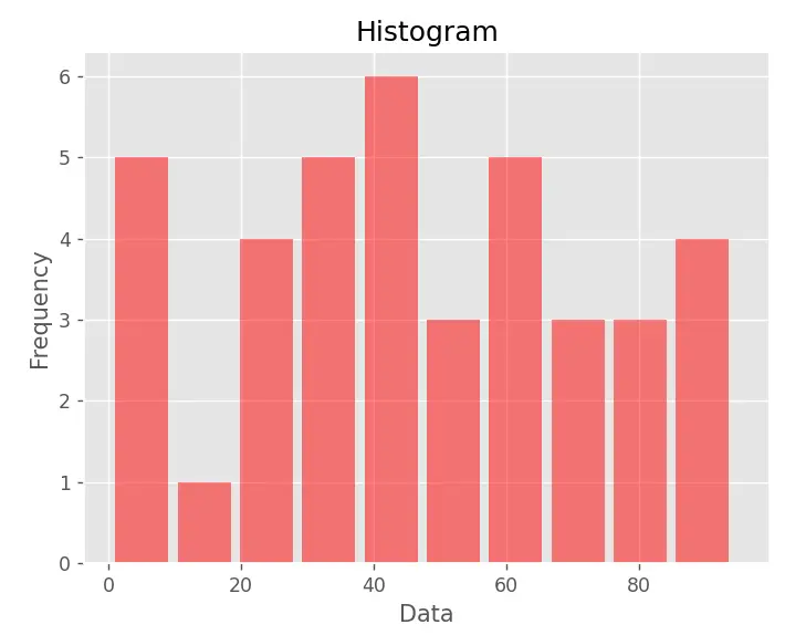
The above snippet shows the modified version of the histogram created in the previous example.
How to Calculate the Number of Bins?
Bins are used in charts plotting to group values according to a single range of continuous values. For simplicity, we used bins value 10 in the “plt.hist()” function as an argument.
Follow the following steps to manually calculate the number of bins:
Step 1: Creation of Dataset
We can initialize any data set value in Python for plotting histograms. For instance, we will take the following dataset:
Data_Set = [1,5,10,15,20,25,30,35
           ,40,45,50,55,60,65,70,75,80,
           85,90,95,45,40,35,30,25,10,5,
           55,65,75,85,95,90,40,30,20,60,45,65, 20]
Step 2: Calculate the Number of Observation
The total number of observation found in the data set is “40”.
Step 3: Calculate the Range Number
To calculate the range of numbers, we need to subtract the maximum value of the data set from the minimum value.
Range = Maximum Value - Minimum Value
Range = 95 - 1
Range = 94
Step 4: Calculate the Number of Intervals
To calculate the number of intervals, we need to square root the value of the number of observations found in the data set such as the Number of Intervals is equals to
√n = √40 = 6.32455532034 = 6
Step 5: Calculate the Width of Interval
To calculate the width of interval follow the following formula:
Width Value of intervals =  Range Number / (Number of intervals)
= 94/6 = 15.6666666667 = 15
Step 6: Find Interval of the Given Data Set
The final interval calculated after using the above observation is shown below:
(0-15), (16-31), (32-47), (48-63), (64-79), (80-95), (95-110)
From the above interval we use the starting value of each interval as the value of a bin. For example, the value of the bin used to plot the histogram is:
bins = [0, 16, 32, 48, 64, 80, 95]
Step 7: Use the Calculated Bin Value in Python
In the code given below the “plt.hist()” function is used to create the histogram of the calculated bin of the given data set:
Code:
import matplotlib.pyplot as plt
Data_Set = [1,5,10,15,20,25,30,35
          ,40,45,50,55,60,65,70,75,80,
          85,90,95,45,40,35,30,25,10,5,
          55,65,75,85,95,90,40,30,20,60,45,65, 20]
plt.hist(Data_Set, bins= [0, 16, 32, 48, 64, 80, 95])
plt.show()
In the above code, the calculated bin value is given as a parameter in the “plt.hist()” function.
Output:
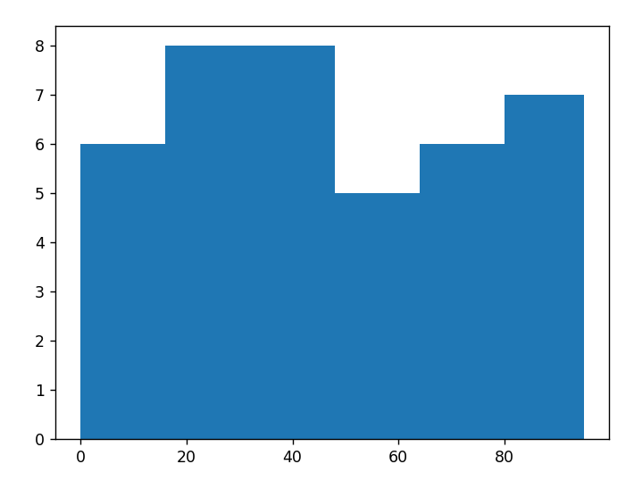
The above output shows the histogram of the given “data_Set” value.
Conclusion
To plot the histogram, the “plt.hist()” function is used in Python. It can be modified using the “plt.hist()” attributes and the “plt.style.use()” function. The default bin value is “10 ”, and we can also calculate the value of the bin using various formulas. The histogram modification, such as labeling the title or axis, styling the graph, etc., is done using various functions of matplotlib. The tutorial delivered a complete guide on plotting a histogram using the Python matplotlib module.